10 Mar Choosing Art for Healing Spaces: DOs & DON’Ts
The science is in and it proves that ART should not be ignored in healing spaces.
Art’s influence has been measured to expedite healing, counteract post-op anxiety & depression, as well as significantly decreasing the likelihood of a patient switching over to stronger painkillers.
However, not all art is created equal. There are many studies now that show us exactly what works and doesn’t work in healing spaces. Read on for a quick overview on the DOs & DON’Ts of selecting art for these sacred spaces.
Healing Colors
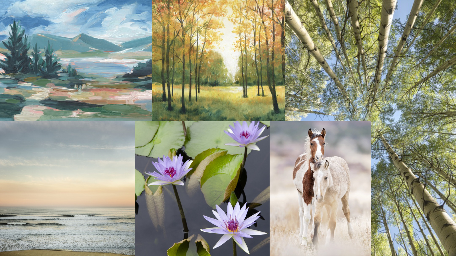
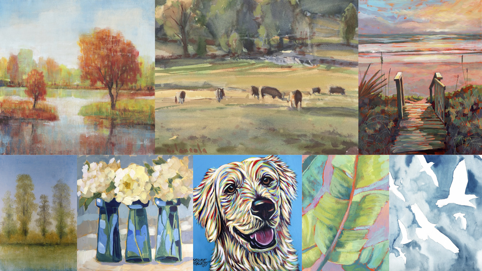
The colors that have the biggest impact on healing are colors that correspond with healthy natural environments– colors that subconsciously indicate to “flourish”. Landscapes with happy blues and healthy greens then are a great range for inspiring healing. You don’t have to limit yourself to only blues and greens though- any color can work depending on the shade and how it is used.

Colors to Avoid in Healing Spaces
Our body responds in a physiological way to different colors. Reds, oranges, and yellows are often interpreted on the negative side of emotions as the often have represented “warnings” in the natural world. Healing spaces also ought to avoid extremes in either direction– too somber or too energized can have a negative effect on the viewer.

Healing Motifs
Just as important as the colors used, the motifs and symbols represented in an image elicits a response in the viewer. With that in mind, the symbols and motifs that are best for healing spaces are those that inspire growth, freedom, happiness, and calm. Healthy landscapes and other natural motifs are often featured as they bring the outside into traditionally sterile environments and allow for the viewer to gaze into them. The whole point of art in healing spaces is to reinforce a healing mindset (avoiding additional stress) and to allow the opportunity for positive distraction & engagement.

Some examples of good motifs: nature, flowers, waterways, happy or silly animals, pastoral scenes, sunrises & sunsets, etc.
Motifs to Avoid in Healing Spaces
On the flip side, some of the motifs & symbols to avoid in healing spaces are those that incite anxiety, reference non-flourishing natural environments, anything too graphic. Jagged edges, cracked edges, overly busy or concentrated works all elicit an anxiety response. Winter scenes, bare trees, or otherwise “cold” subject materials do nothing for inspiring a positive physiological response. Overly graphic or “too-abstract” art doesn’t allow for most to be able to engage with as there’s no “story” to use as a positive distraction. Anything that references death directly or indirectly obviously is a no.

Some examples of bad motifs: Obviously anything reminiscent of death or dying: skulls, dead flowers, anything that looks like blood (intended or not), winter scenes, empty abstraction, city images, overly graphic works, visuals with predominantly jagged edges.


