26 Jul Seattle Art Fair 2022: RECAP, Framer’s Perspective
The Seattle Art Fair finally returned after two years COVID hiatus, and it did not disappoint!
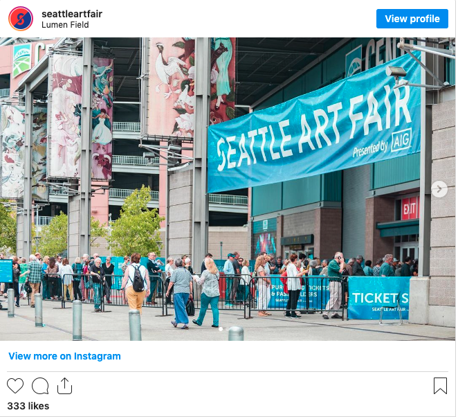
Last weekend (7/21-24th), 85 local, national & international galleries filled up Lumen Field with a tremendous array of artwork.
Being frame-obsessed, we had our eyes peeled to survey how artists and/or galleries are framing their work, and for any new ideas worth stealing. So without further ado, please read on to see what was in, what was new, and what we can predict is coming next.
+ Deep Bevel Frames
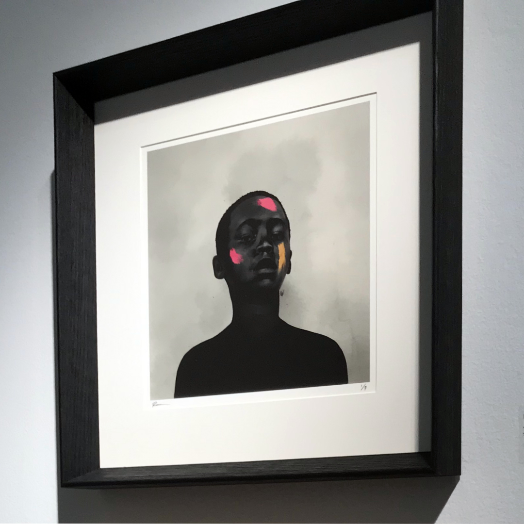
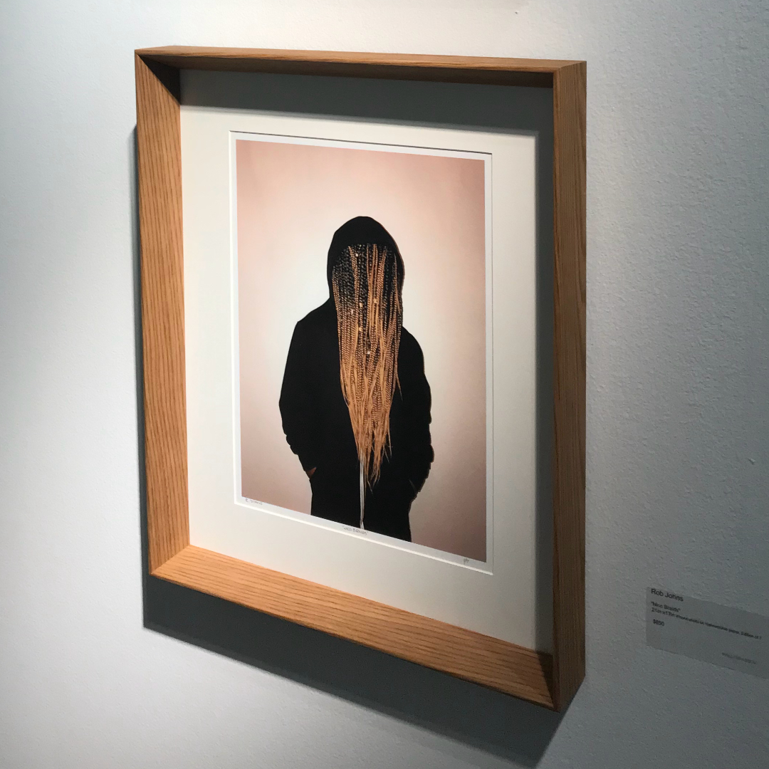
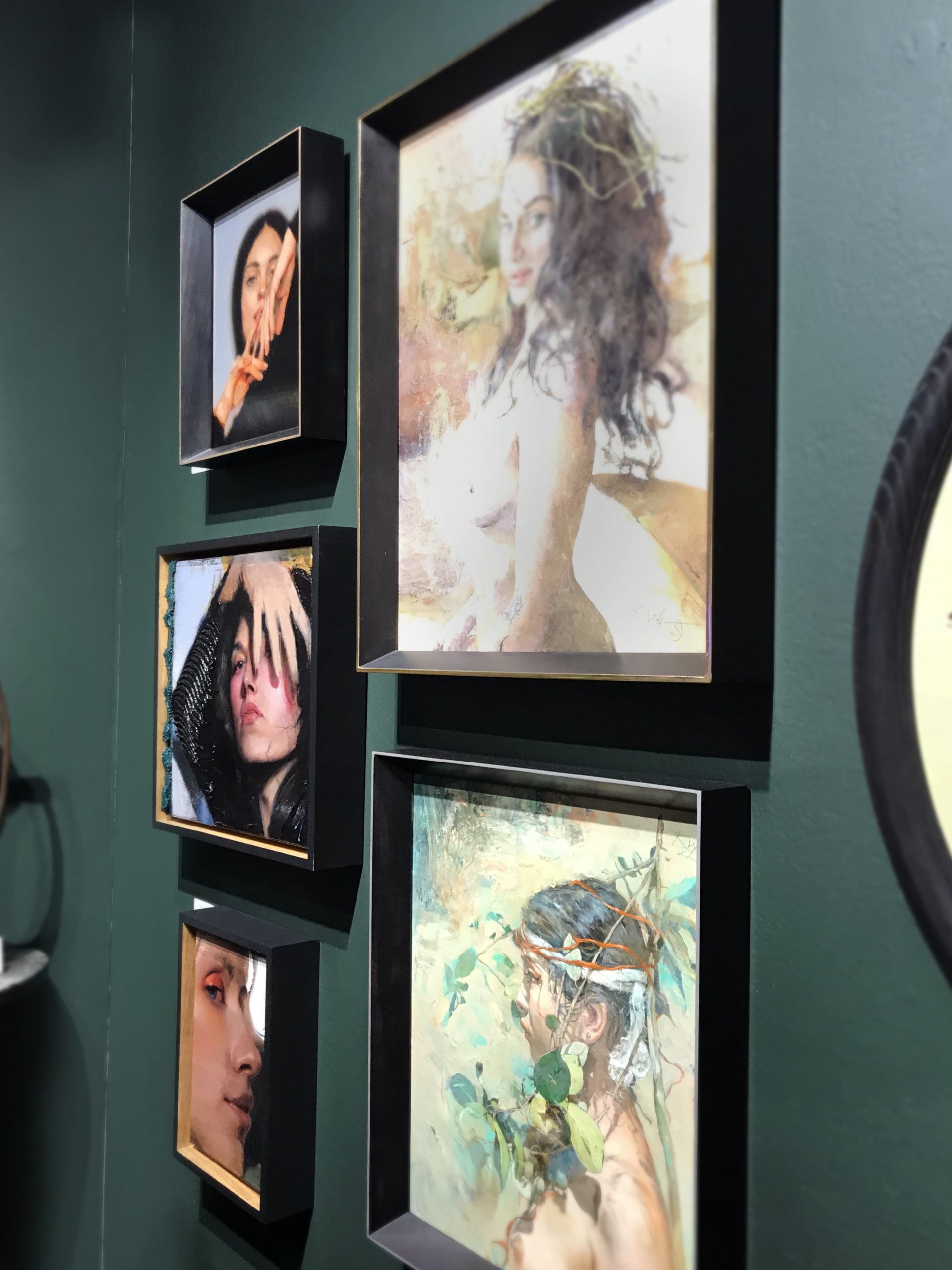
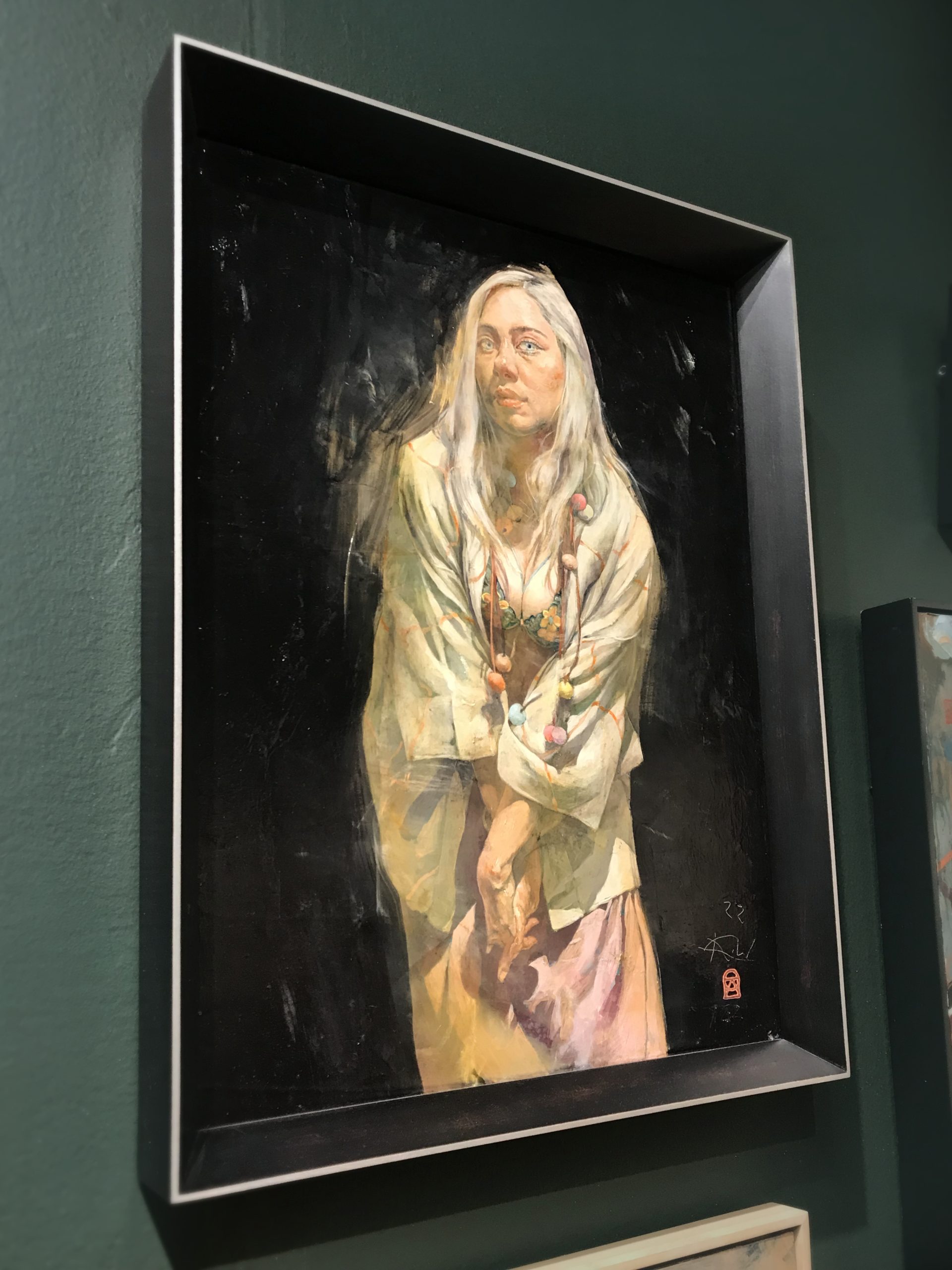
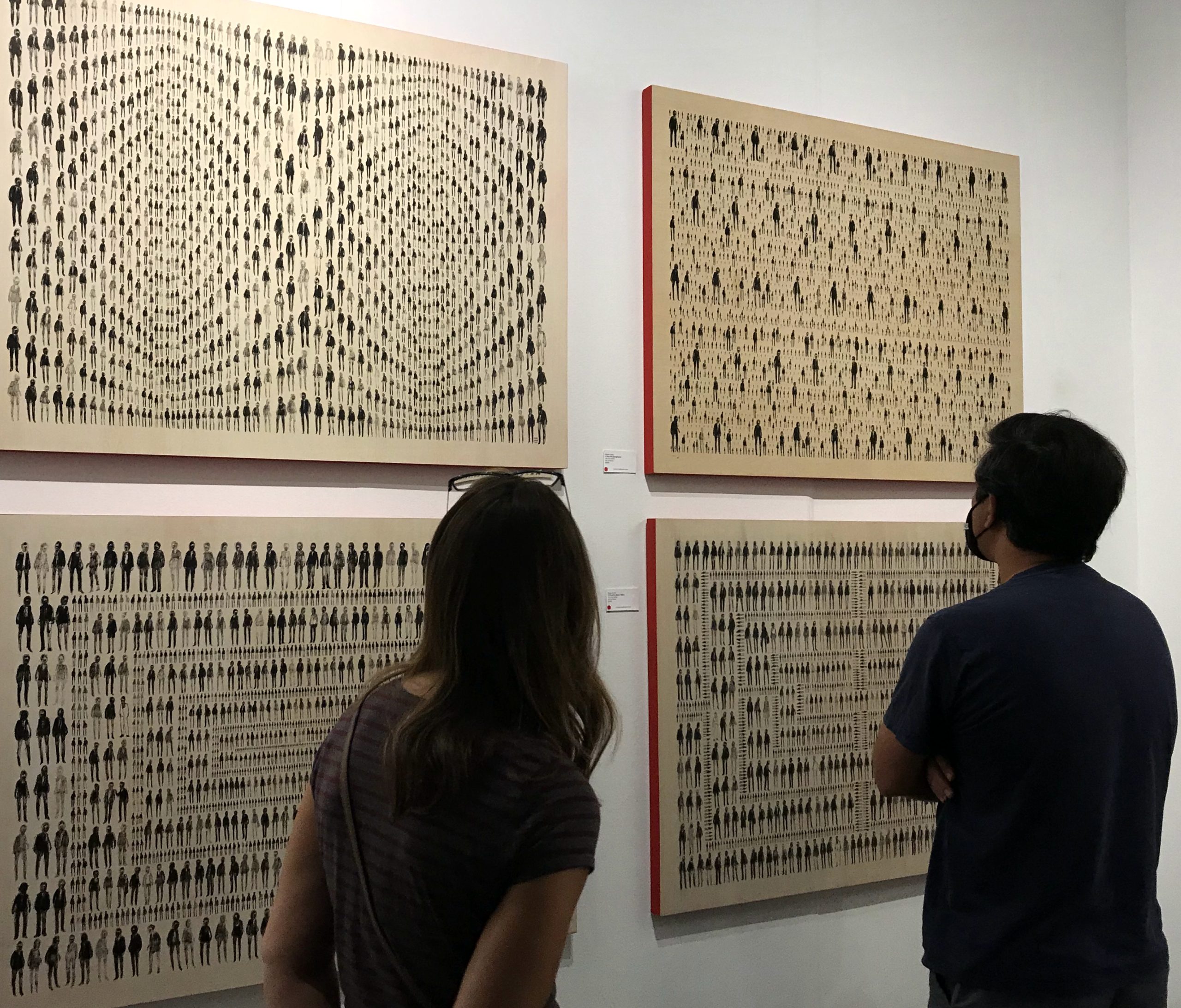
Deep beveled frame profiles were scattered throughout the Seattle Art Fair (SAF). This made a lot of sense to me as this frame profile has been very popular in the framing world. The depth of the frame gives a beautiful dimensionality and the sharpness of the bevel offers a very cool, contemporary framing presentation.
This frame can be used on shallow canvases or panels (represented on the lower two images) or with pieces on paper under glass (strangely enough the two pieces on the top did not have glass. This was likely due to wanting to avoid glare, but there is a glass option for that & these matted images are totally vulnerable as is.) At the last SAF in 2019 that only one or two pieces had this framing presentation.
Top images are by artist RC Johnson, bottom images are by
+ Artist’s Frames
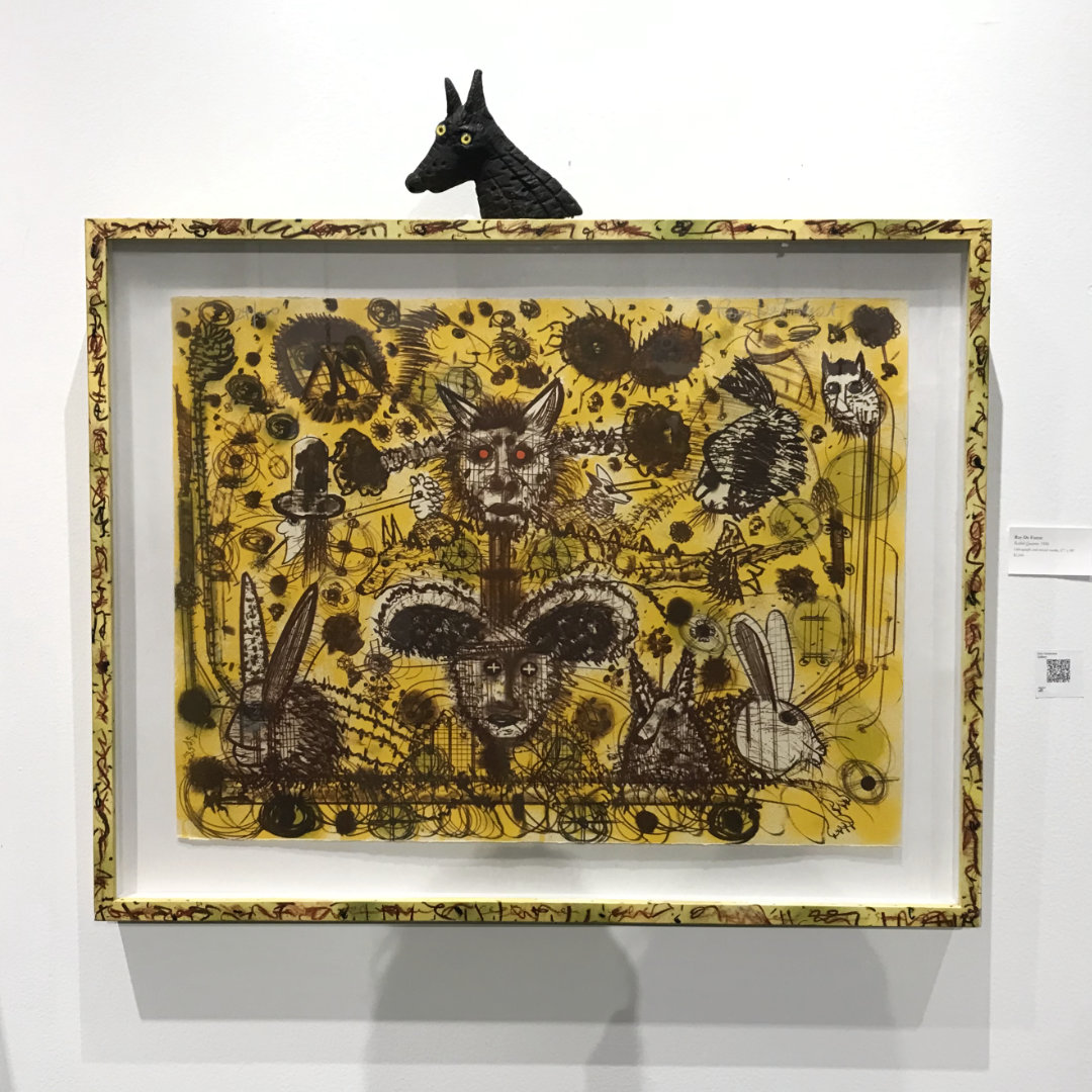
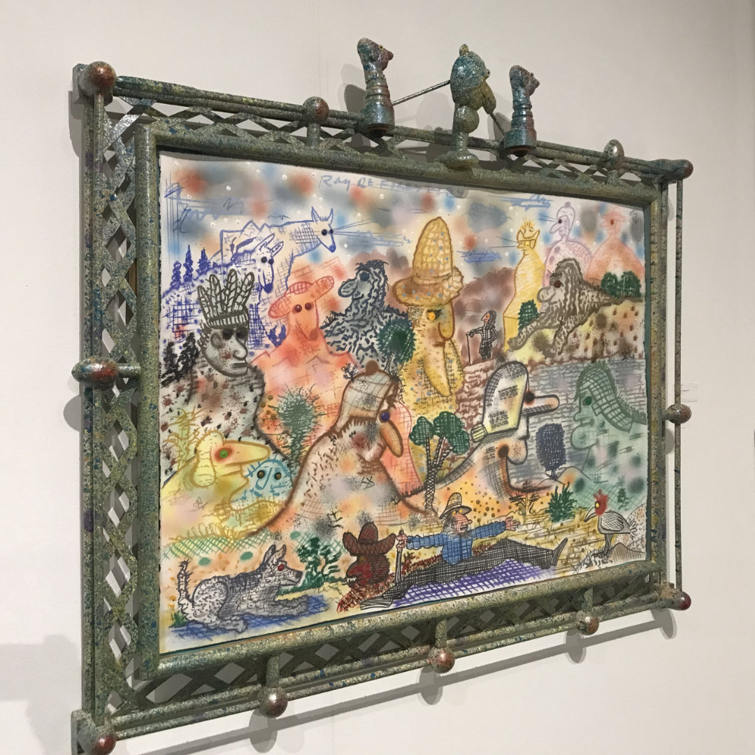
Framing has an incredible way of elevating a work into a whole piece, with it’s own unique character. I was impressed by this artist’s (Roy De Forest) creative framing presentation that continues the artistry of the piece out to the frame and beyond with sculptural frame elements. I predict we will see more artists follow suit with this type of hyper-custom framing as it turns a 2D work into a 3D microcosmos.
Framing has been largely overlooked in modern art history but people are catching on that framing has very real impact with power to add or detract from the overall presentation.
+ Rounded Rectangle, Closed Corner Frame
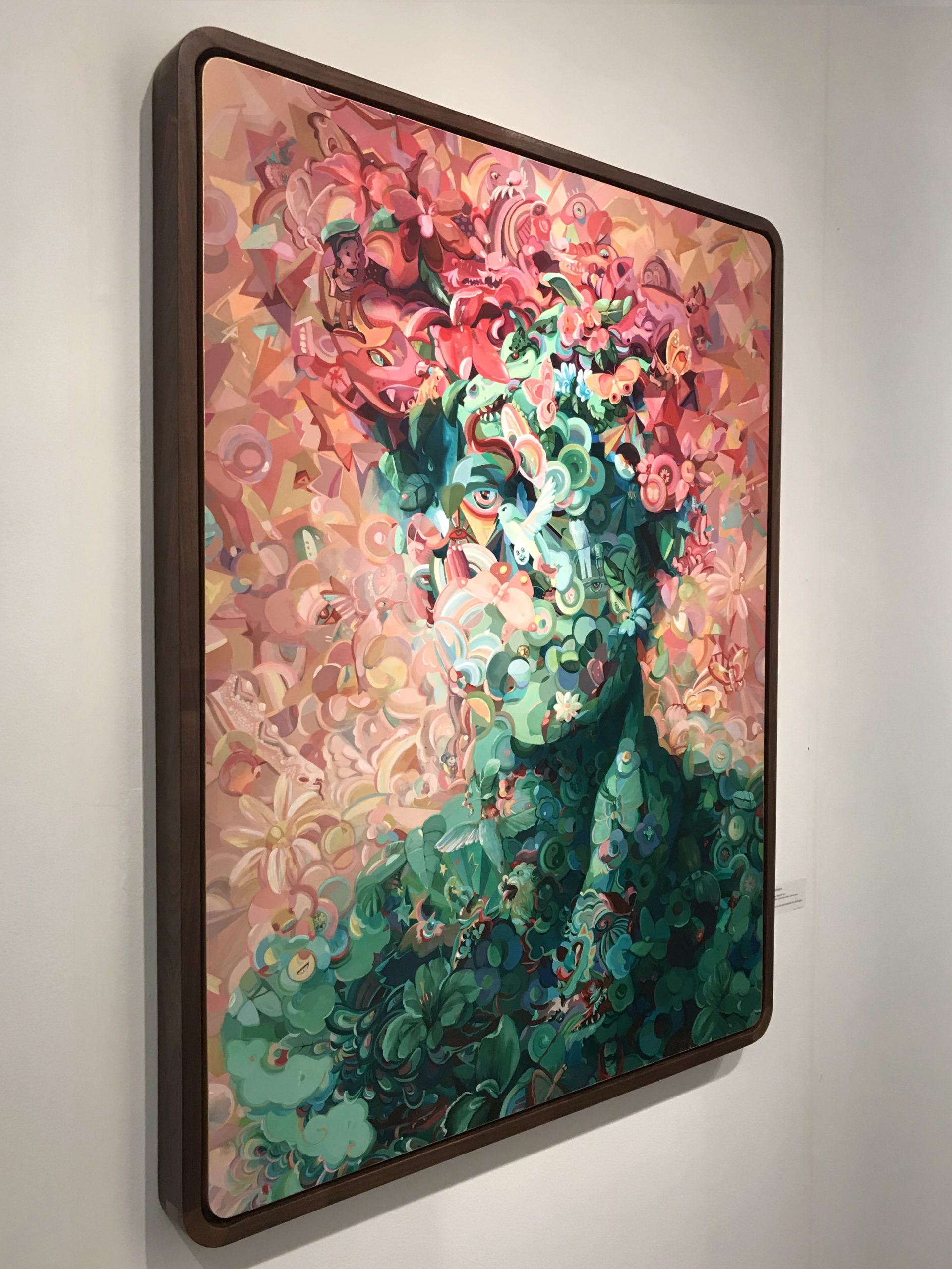
A closed corner frame screams QUALITY. It is unclear if this piece was created with the intent to put it in this gorgeous rounded corner frame but it ends up looking like a seamless, elevated work of art. The painting itself is fantastic but the level of care and attention to choose this framing presentation demonstrates the true artistry of this work. I give this one an A+ for clean contemporary framing.
+ Color Canvas Edges
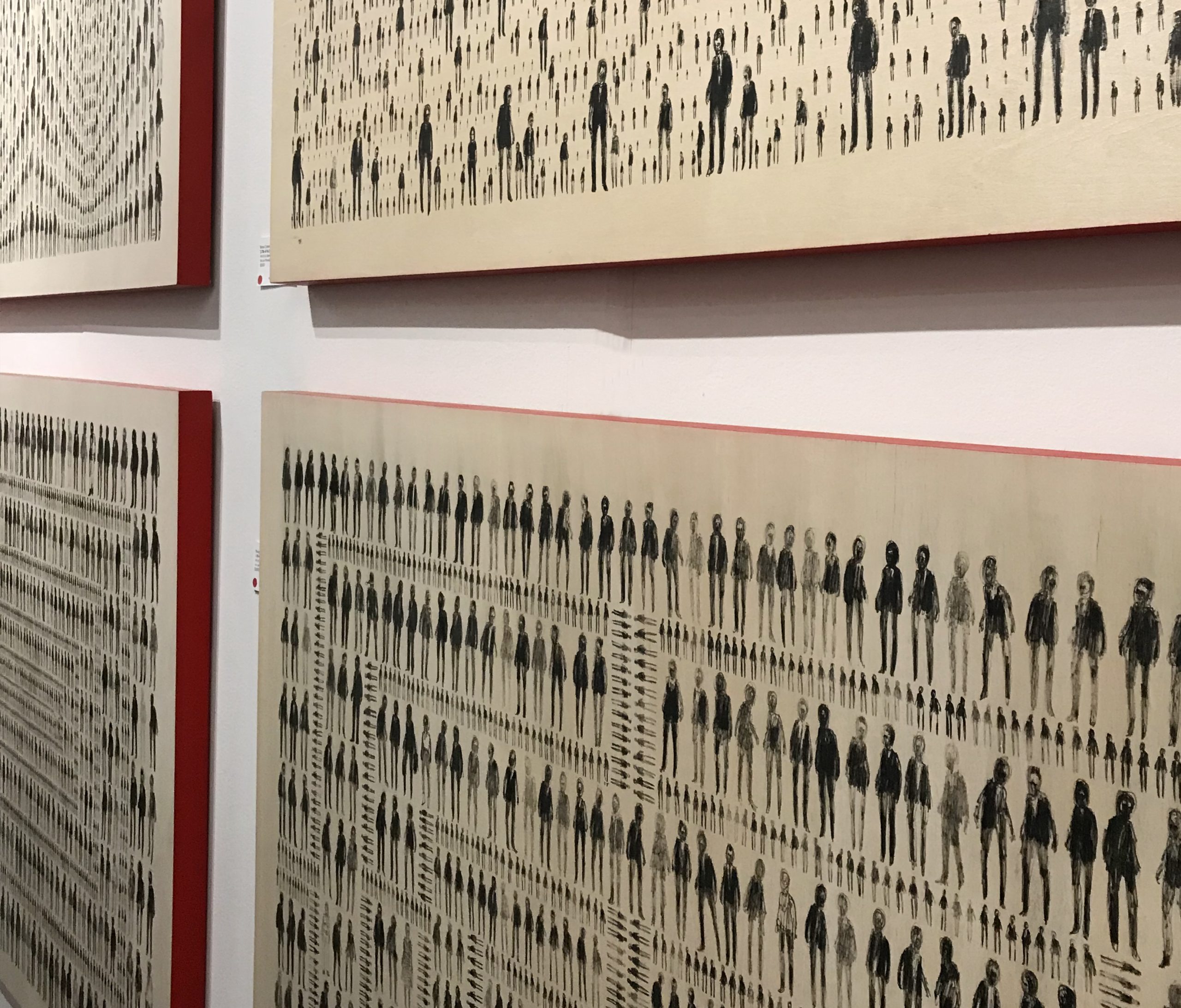
I was excited to see this concept pop up because I think it is a very underused, impactful design element in canvas art: colored canvas edges. With these works by Blake Carter, the juxtaposition of neutral art with the pop of red is just *chef’s kiss*.
I’m not sure if this color choice is at all involved with the work itself but it brings to my mind the sensation of Louboutin’s “Red Bottom” shoes that serve to be an emblem of success in pop culture. Another theory on the choice for red edges is that it could be a nod to tribal warrior paint which would make more sense given the context of the art. Alternatively, the decision to go with red edges could just be an aesthetic decision the artist made to create a more impactful presentation, and it certainly caught my eye!
+ Thick Floater Frames
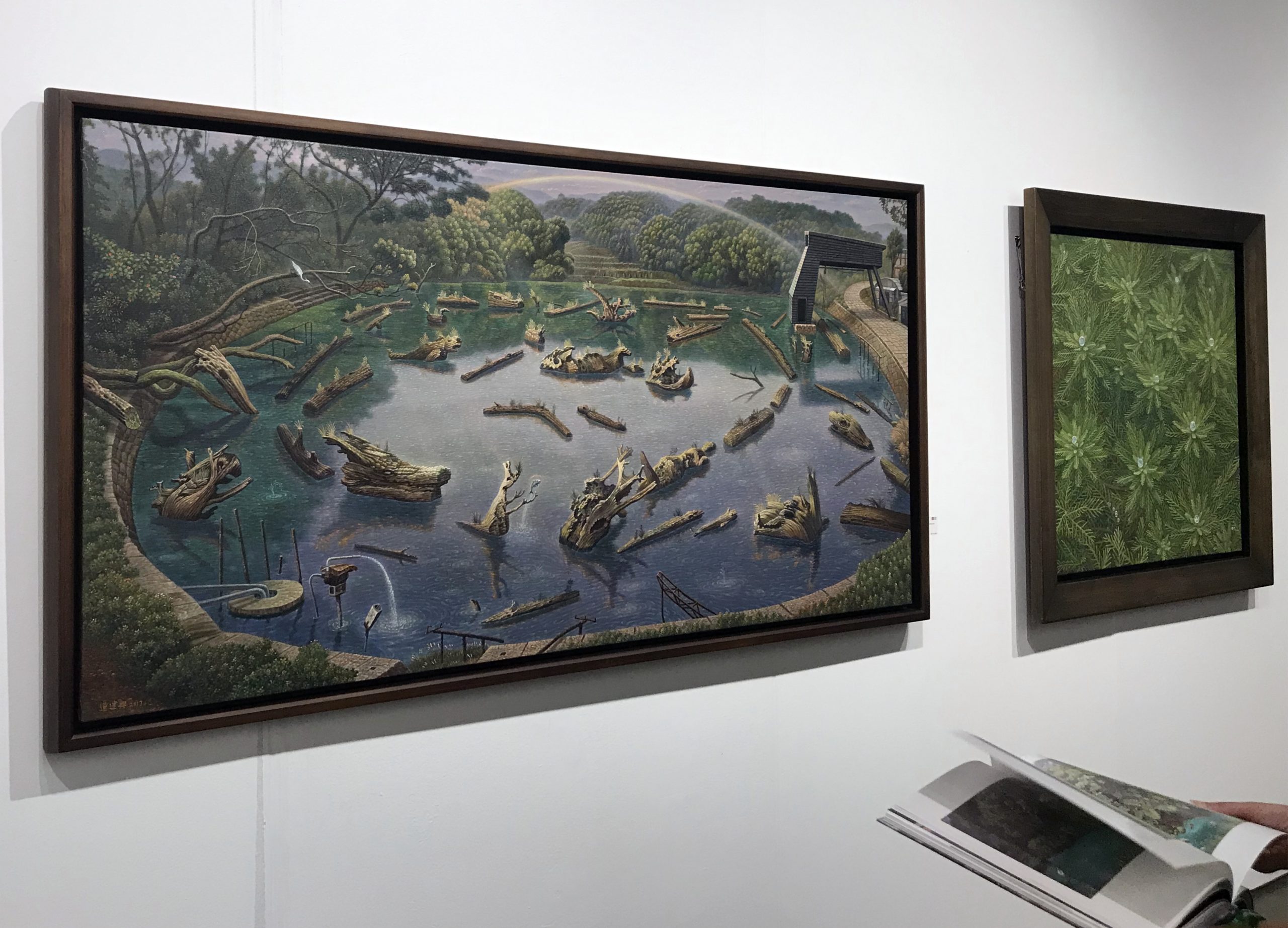
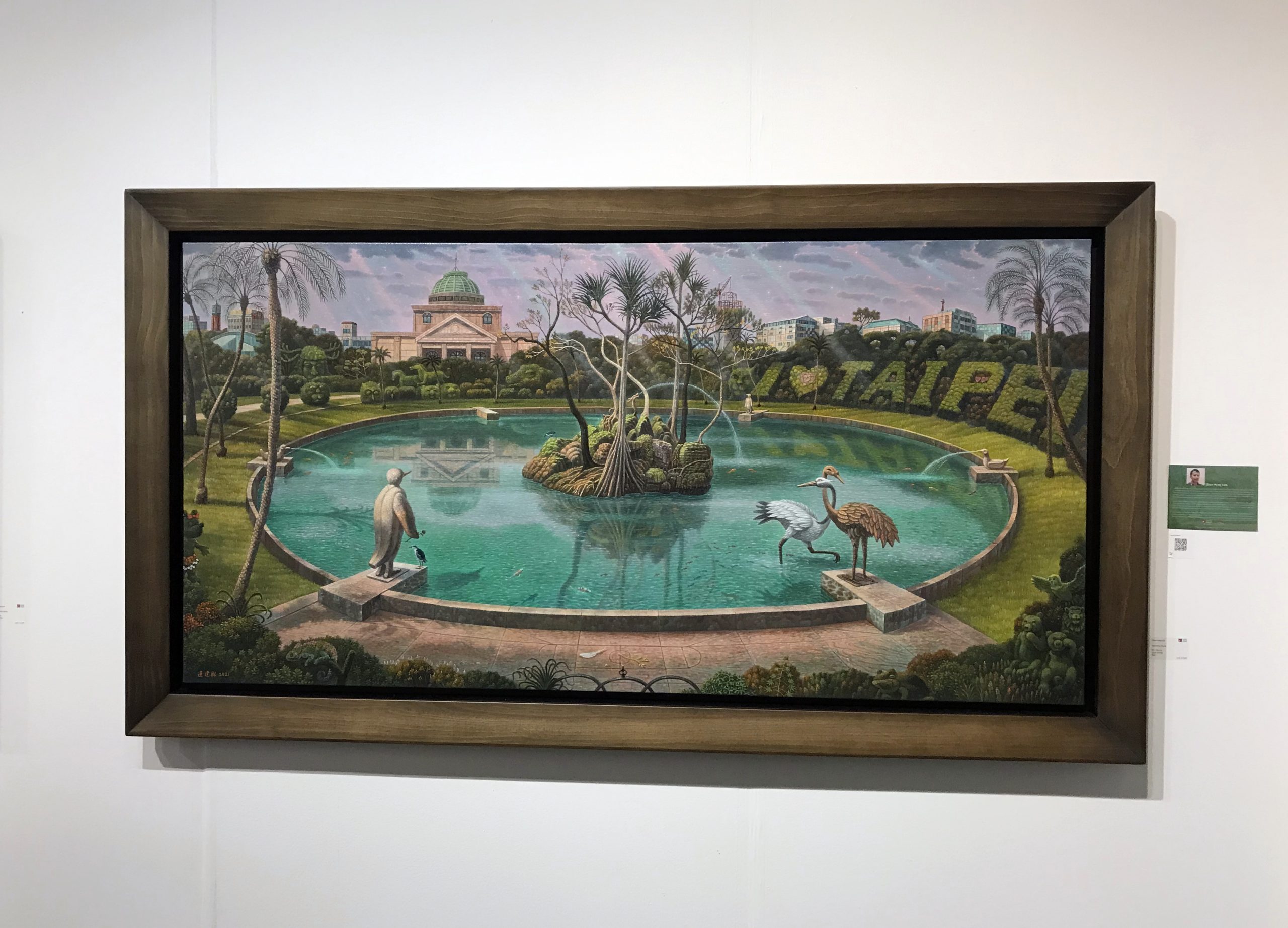
While some are going super thin with their canvas frames, others are going bold with it. I saw a fair amount of thicker floater frames around the SAF. In inspecting these pieces by Chien-Hsing Lien, I believe they are actually a floater frame inside of a thicker picture frame to create this presentation. If not, I need to find their moulding vendor because its a good look for these pieces and thick floater frames are surprisingly hard to find.
+ Colored Backs, Diamond Hanging
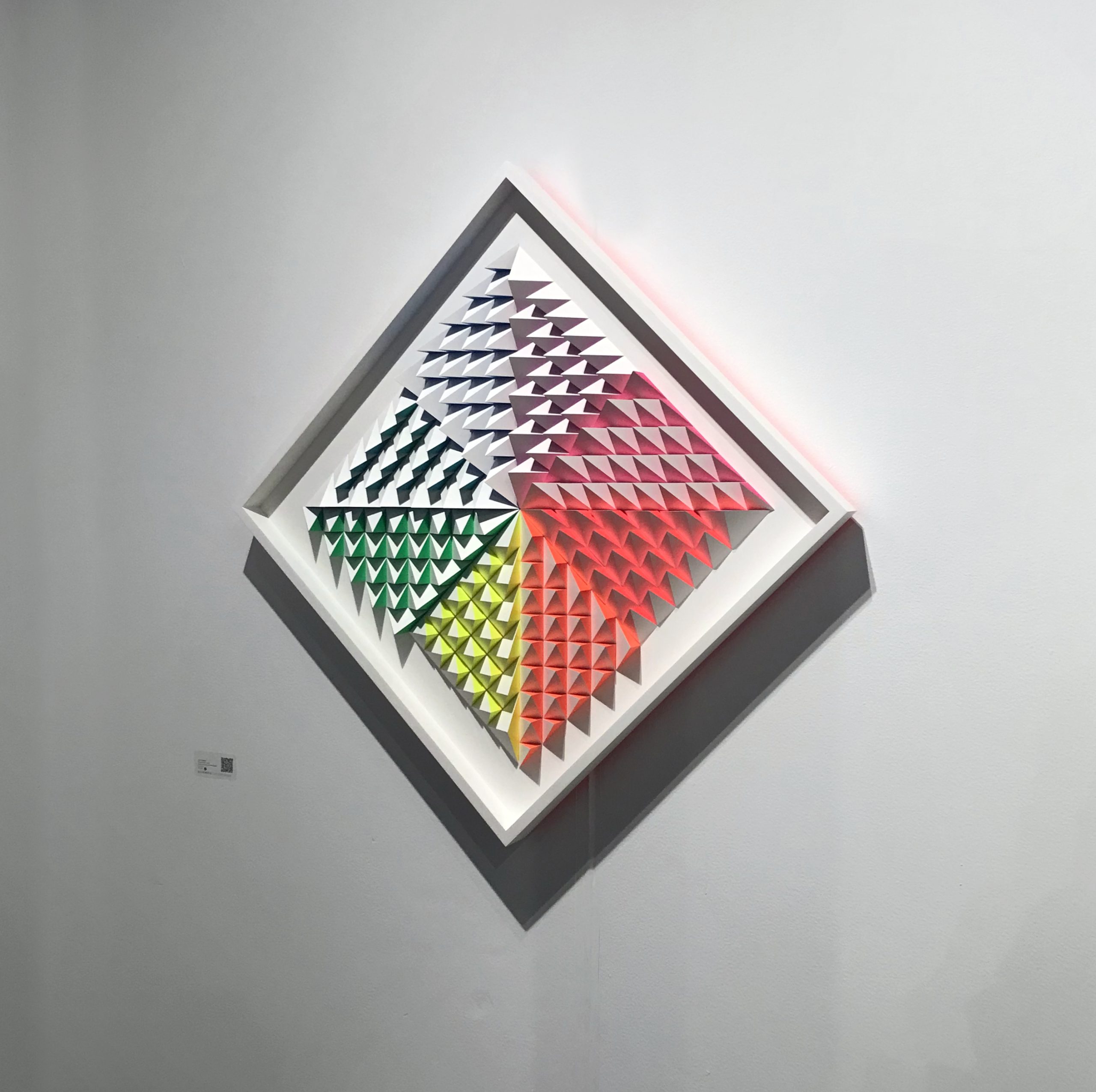
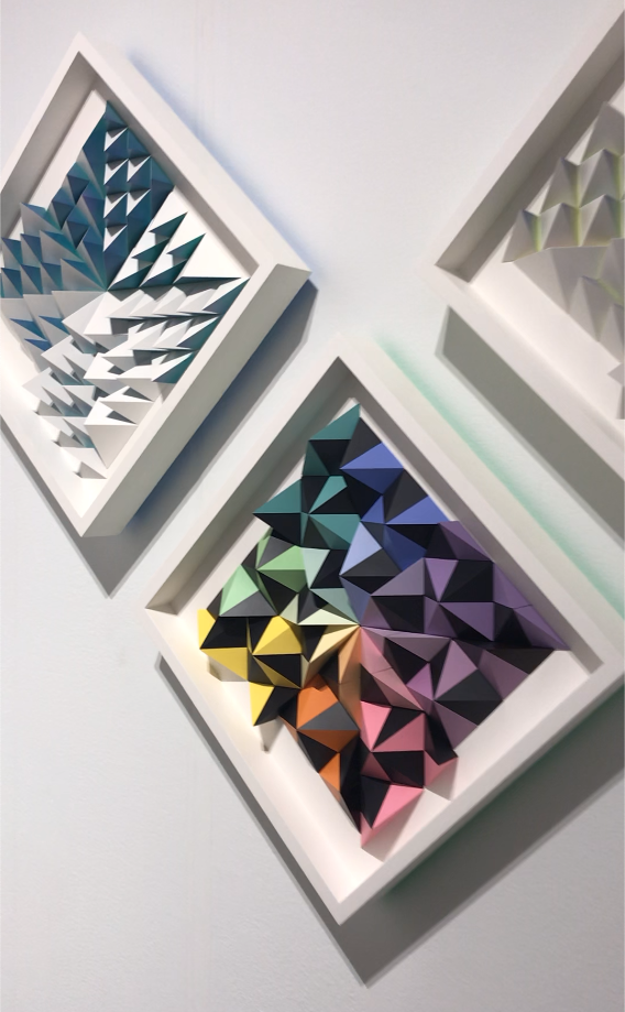
This was one of the most innovative framing presentations I saw at the Seattle Art Fair— you can tell a lot of careful thought went into envisioning the framing as a part of the artwork.
It’s difficult to capture in photograph but in person these pieces absolutely glow against the white walls they are hung on. The artist, Sean Newport, created this effect by having a beveled panel behind the frame with a bight color painted on it, which reflects against white to create a glowing neon-esque presentation.
Also worth noting is that the artist chose to hang these square pieces rotated, which was a presentation I saw at one or two other galleries. I don’t generally like when artists choose to do this, as often it feels arbitrary “uniqueness”, but I think this presentation works with these paper pieces, especially when hung as a set.
+ Acrylic!
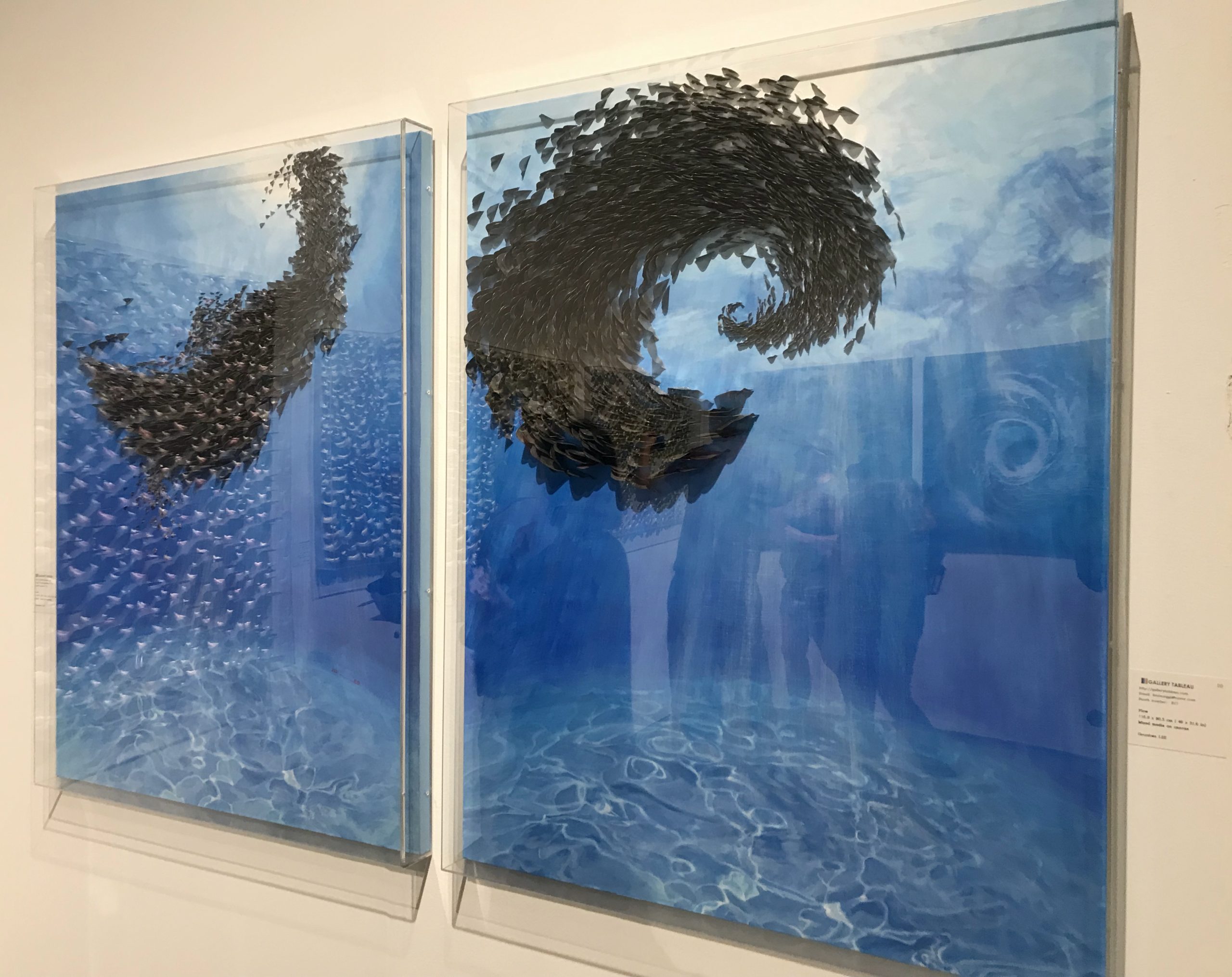
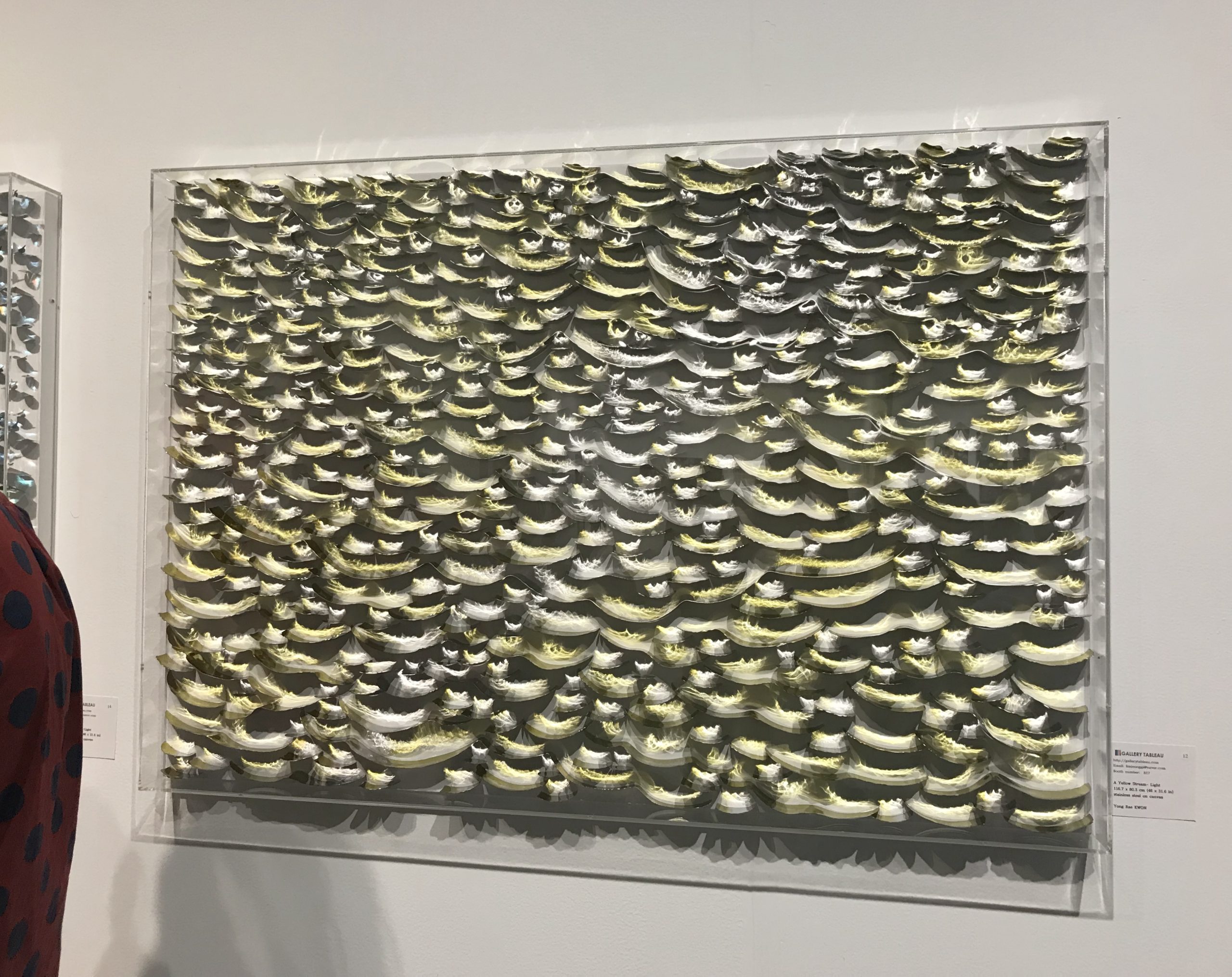
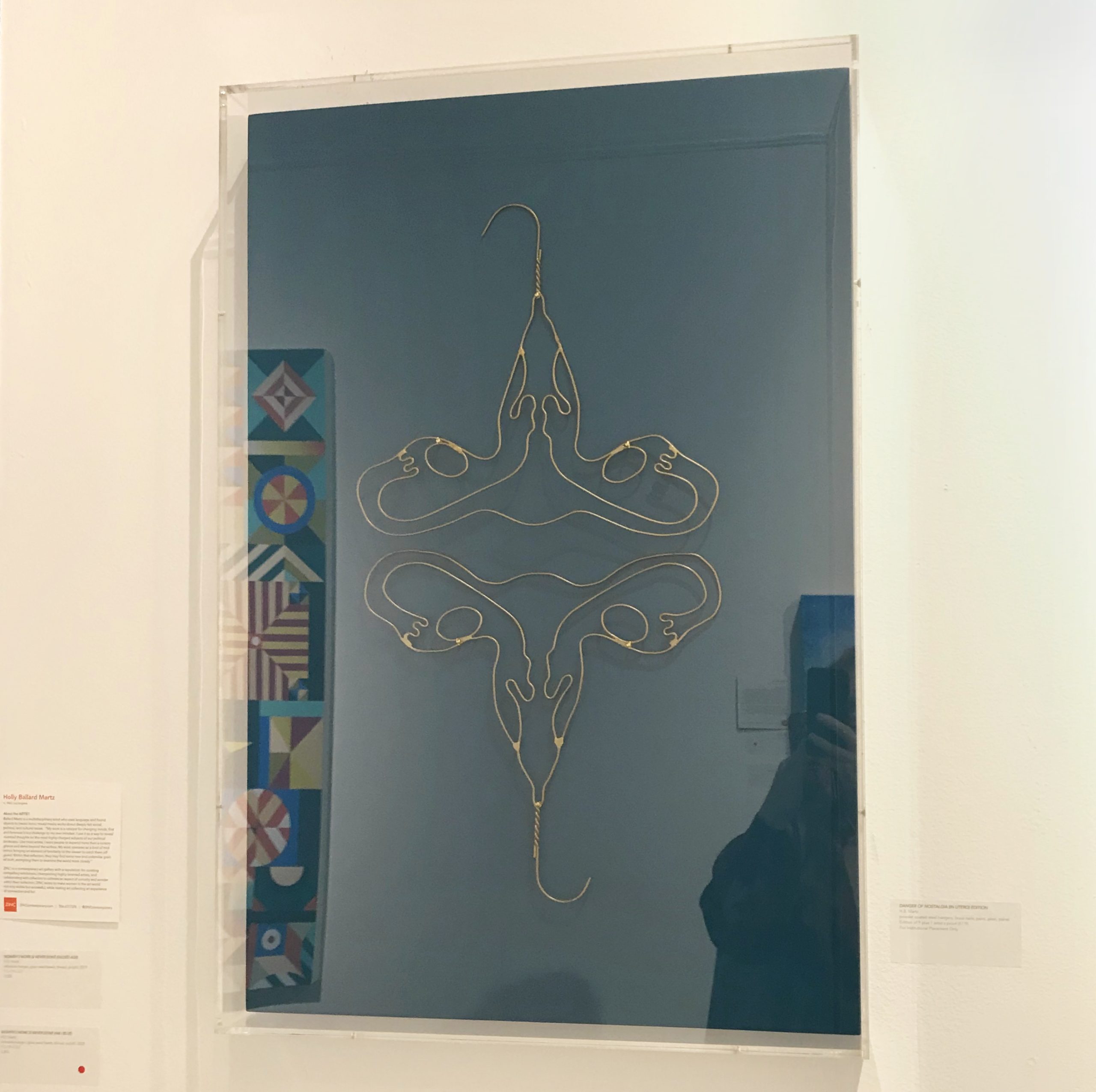
Acrylic had a high prevalence in the Seattle Art Fair this year, mostly in the form of boxes but also some standoffs and some layered pieces with multiple sheets.This likely has to do with an increased amount of artists adding three dimensional elements to their work, necessitating three dimensional protection.
What was surprisingly not present was the use of colored acrylic in displays. I’d put money that trend shows up next year.
Artists from top to bottom: Geun Hwa Lee, Ying Rae Kwon, & Sofia Arnold
+ Other Noteworthy Framing Presentations:
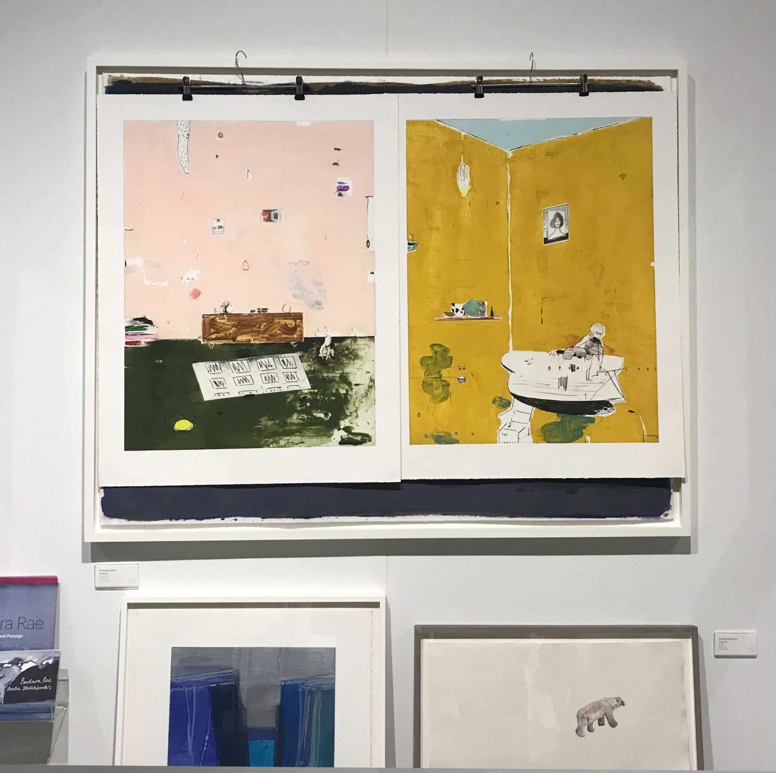
This gallery chose to hang works on paper with clothes hangers, over a float framed canvas. Admittedly I loved this choice for these pieces because it continues a sense of domesticity from the artwork and is just an interesting contemporary presentation choice. The gallery attendant expressed it was just a last minute way of displaying paperworks. I think there is potential in this idea.
——————
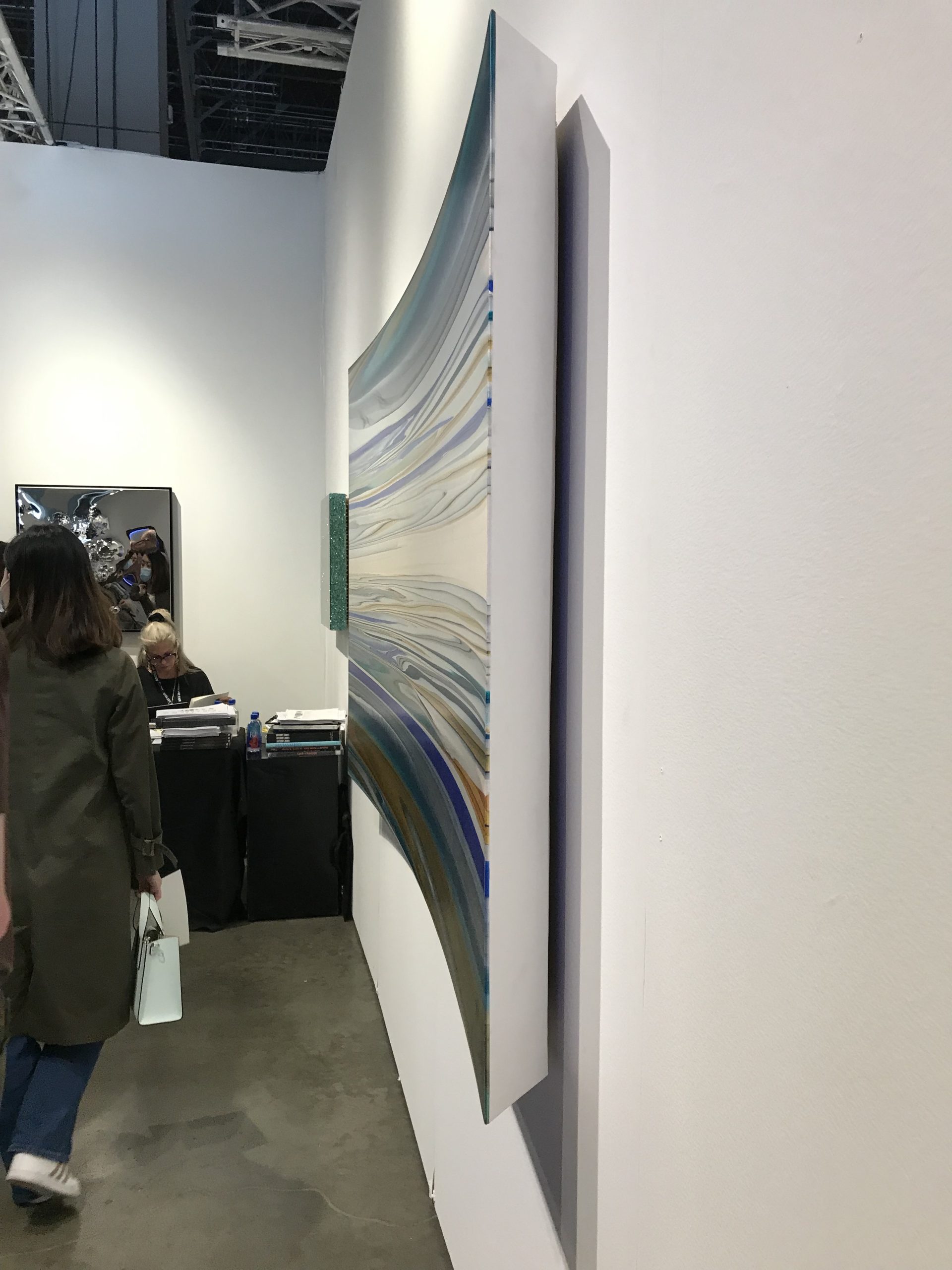
This was an impressive, understated presentation that would be a huge challenge to build! This artist managed to create a curved, wrapped canvas with a steep sloped back. I would love to see the process of building this one. Unfortunately I did not write down the artist’s name but it was shown at Cult Aimee Friberg’s space which put on a tremendous show.
——————
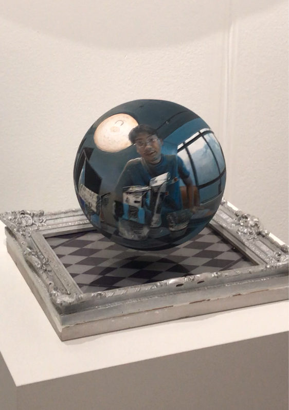
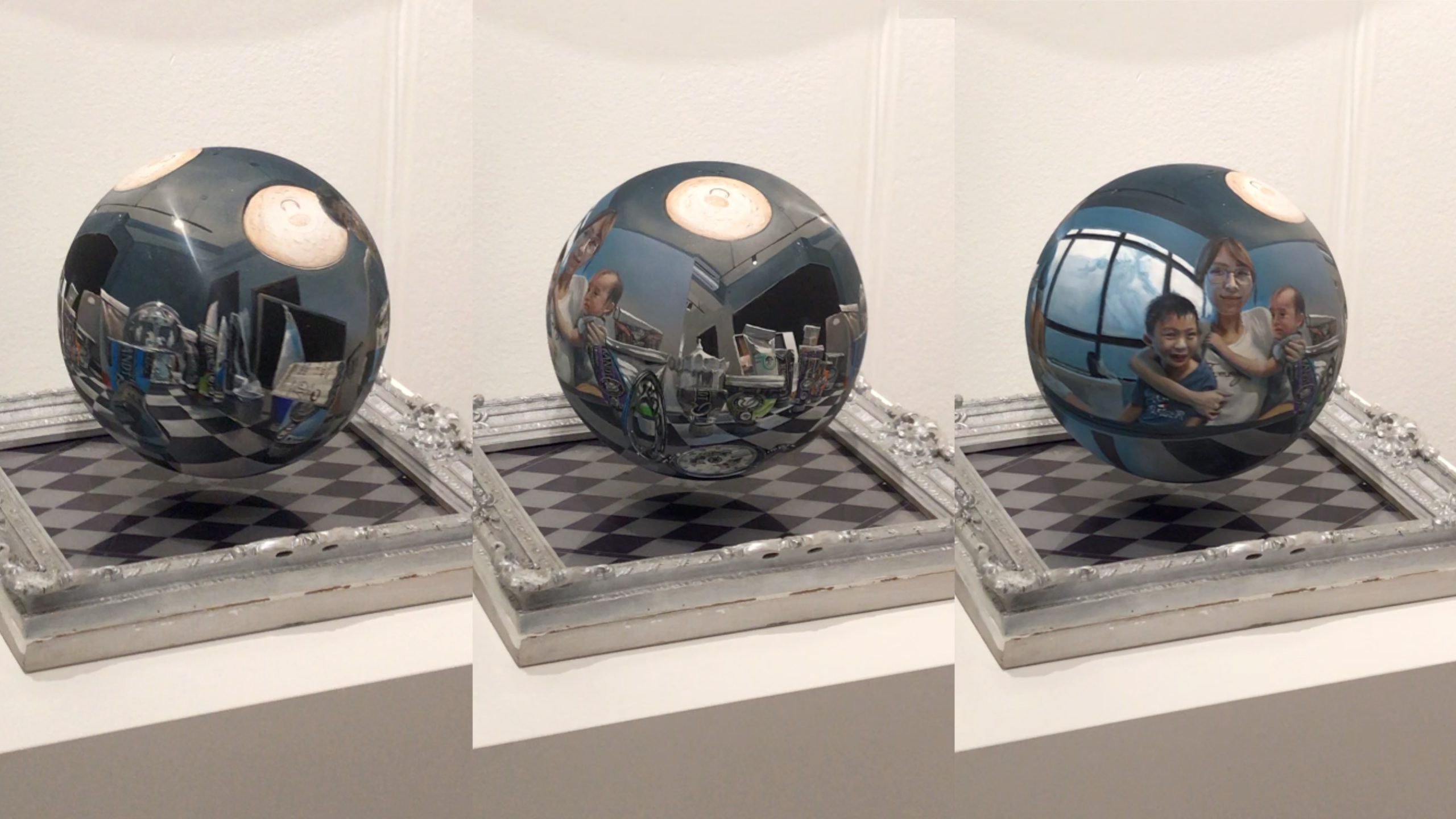
Lastly, one of my favorite pieces of the entire show. This artist, Sheng-Rui Yu, painted a portrait of himself and his family on a three dimensional globe (MC Escher style) but then made it float & spin using magnets in the globe and in the frame below. Mark my words that you’ll be seeing a lot more magnetic framing presentations, and we are totally here for it.
——————
